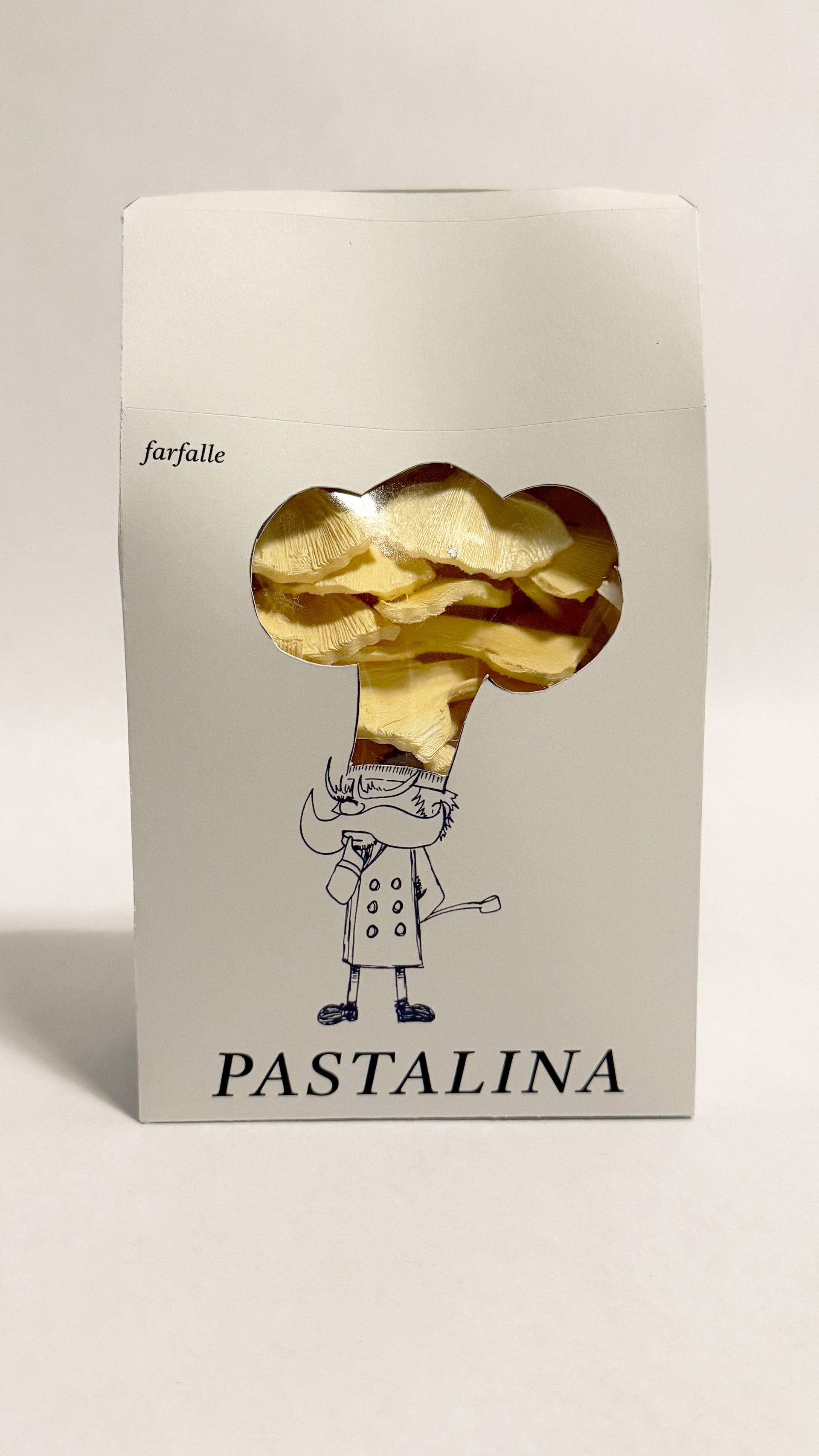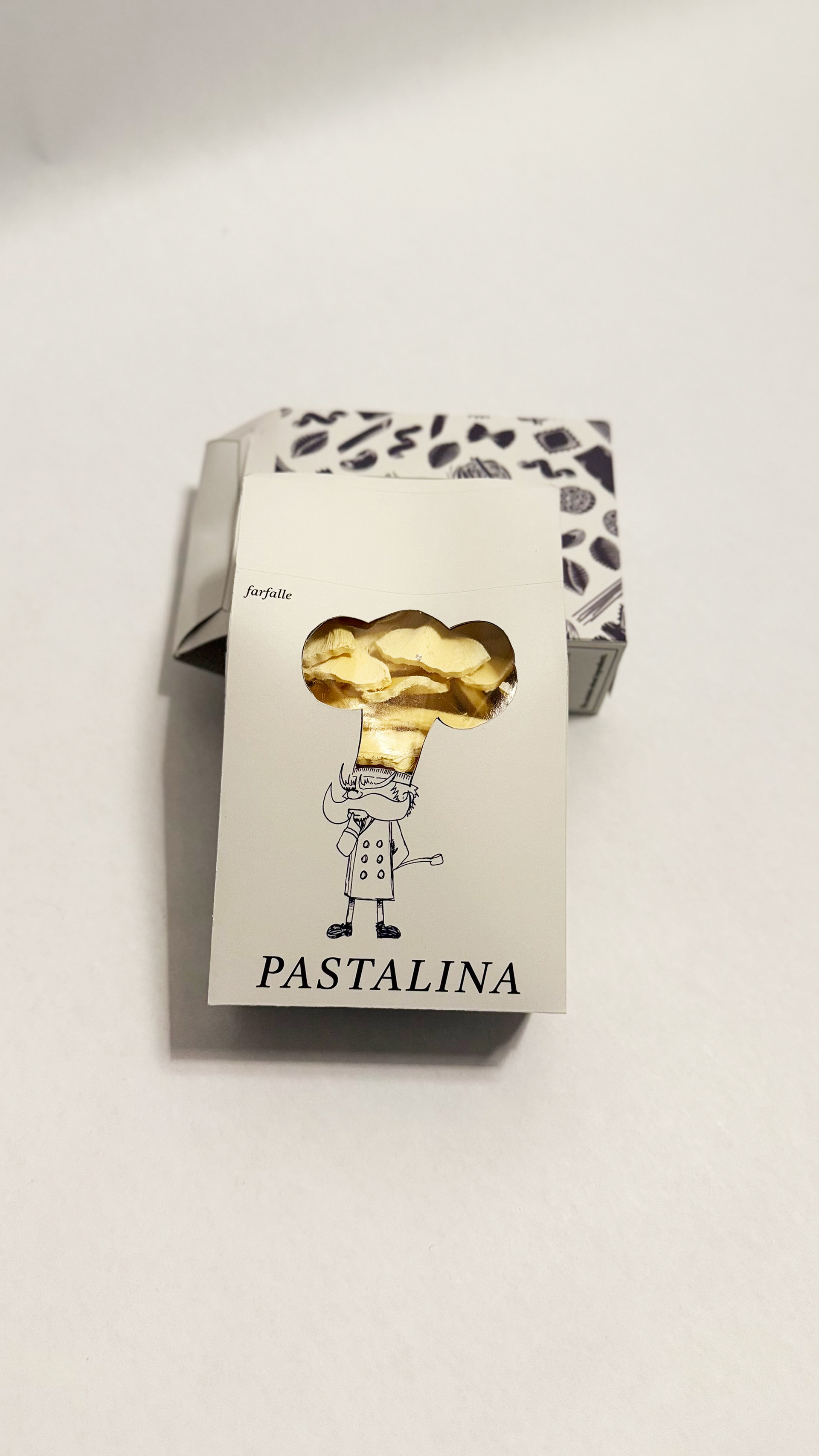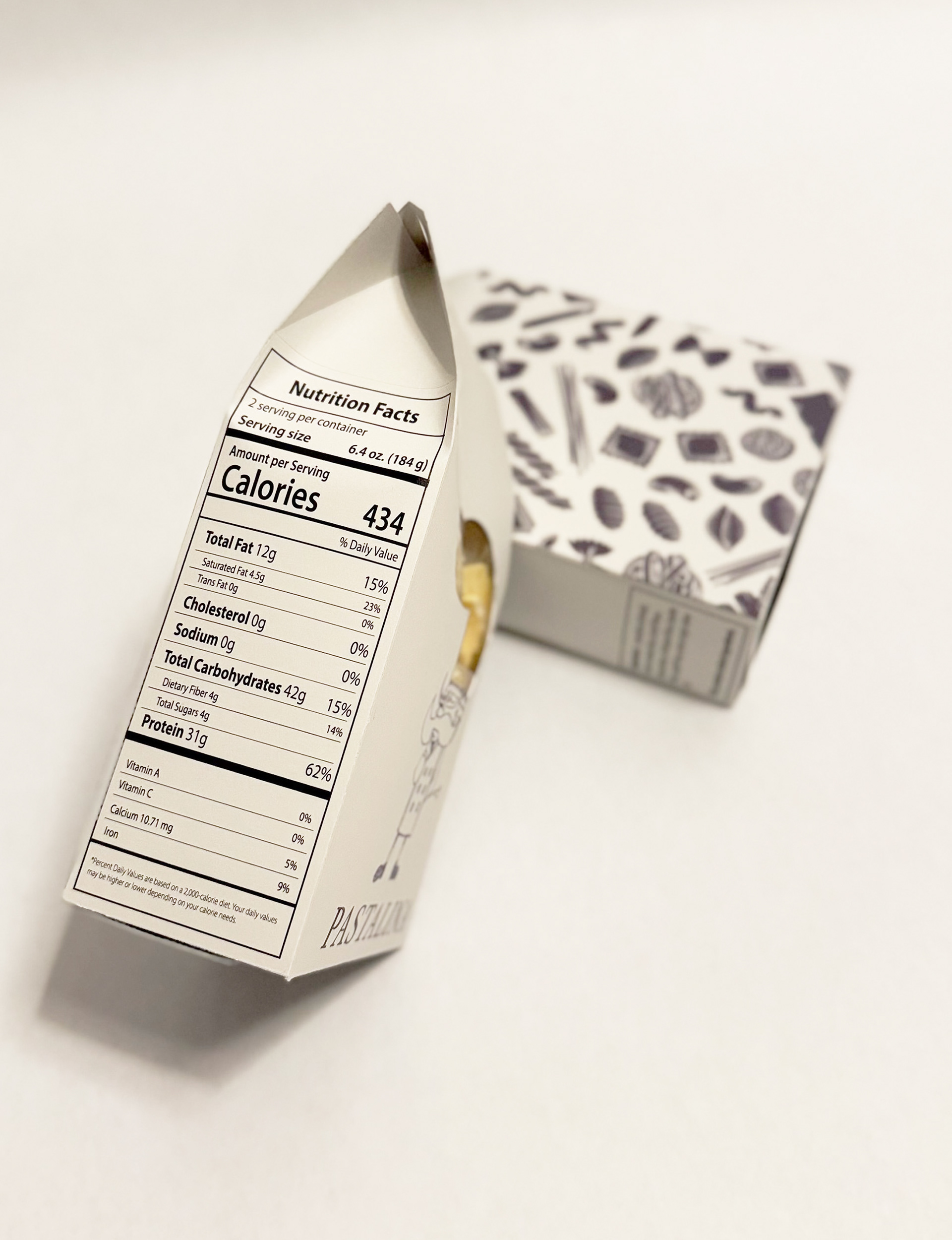
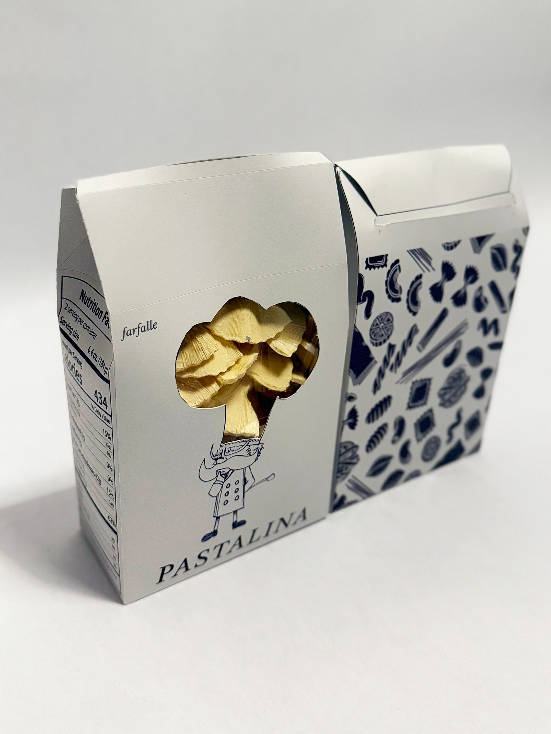
The Pastalina pasta packaging combines creativity with practicality. A chef’s hat-shaped window playfully reveals the pasta inside, integrating with the illustrated character for a fun, interactive design. The compact box features a pasta-patterned secondary package, enhancing its artisanal feel. A clean nutrition panel ensures clarity without compromising aesthetics.
To align with eco-conscious values, the packaging is designed using bamboo-based paper with a waxed interior, ensuring sustainability while preserving product freshness.
This whimsical yet functional design makes Pastalina packaging as delightful as the pasta itself.
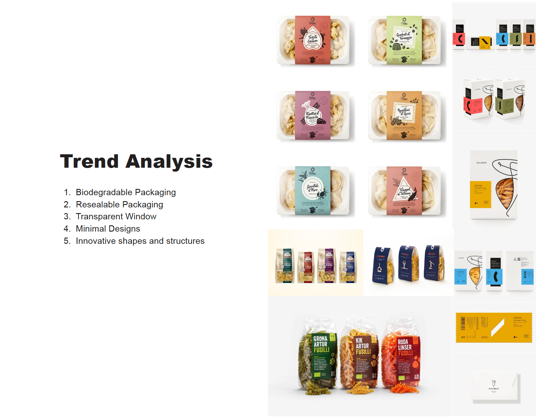
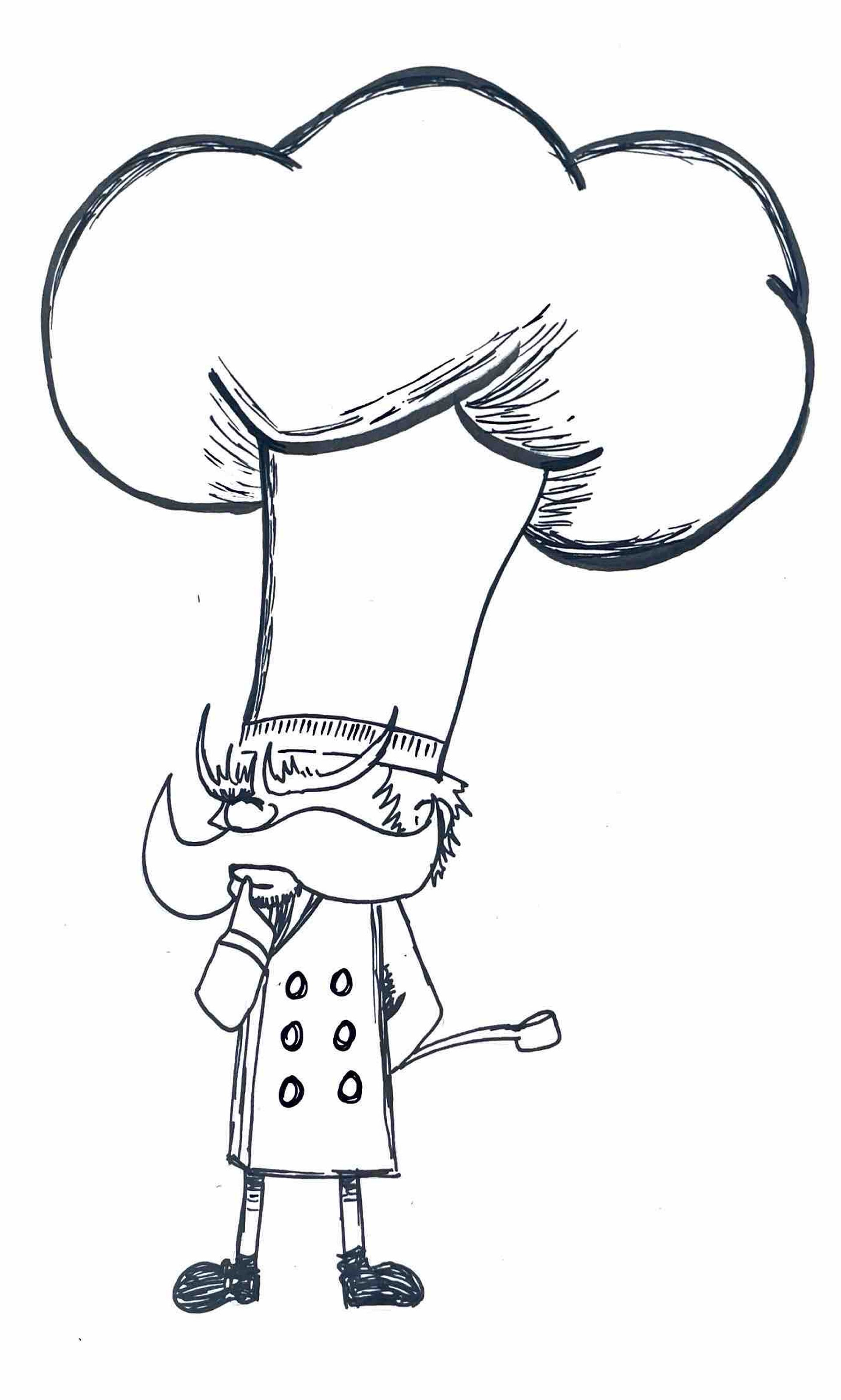
Ideation
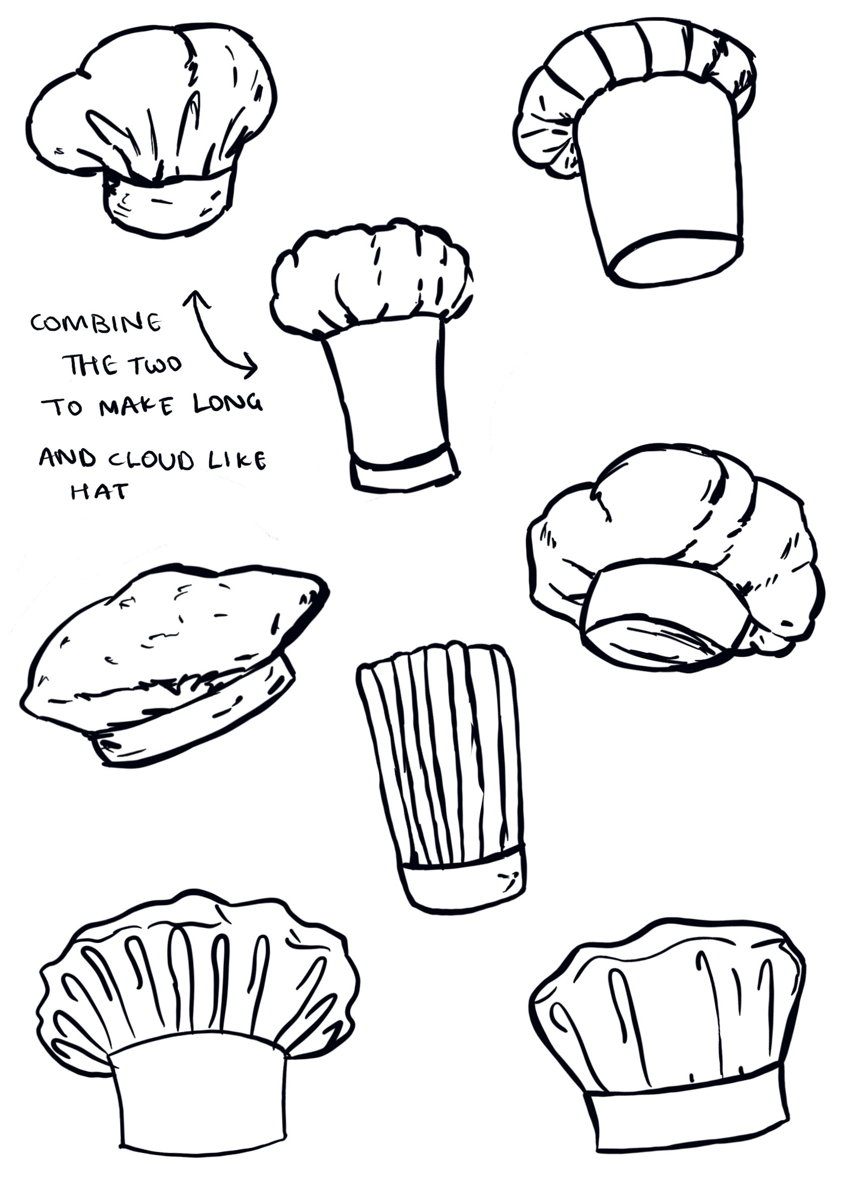
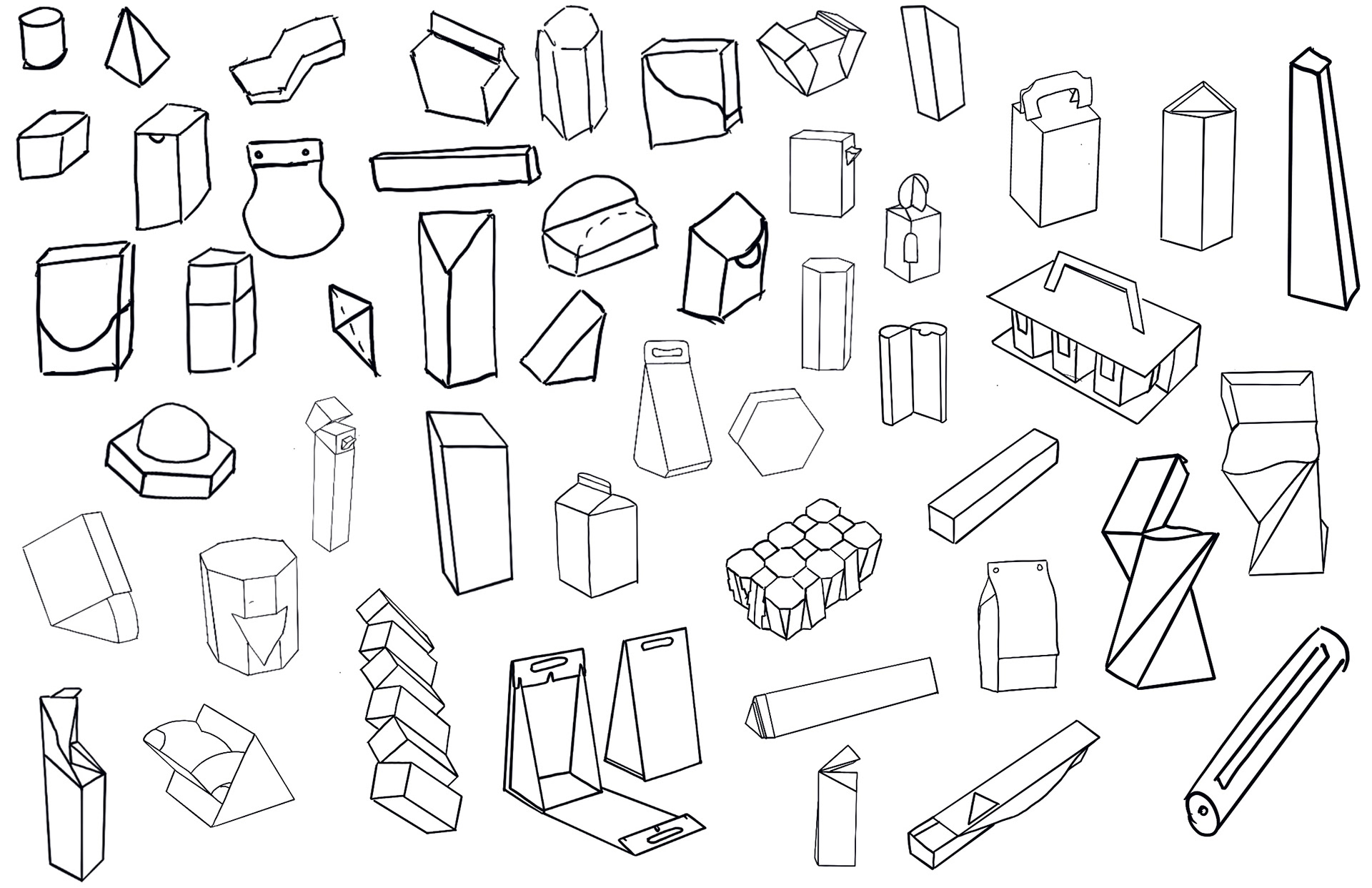
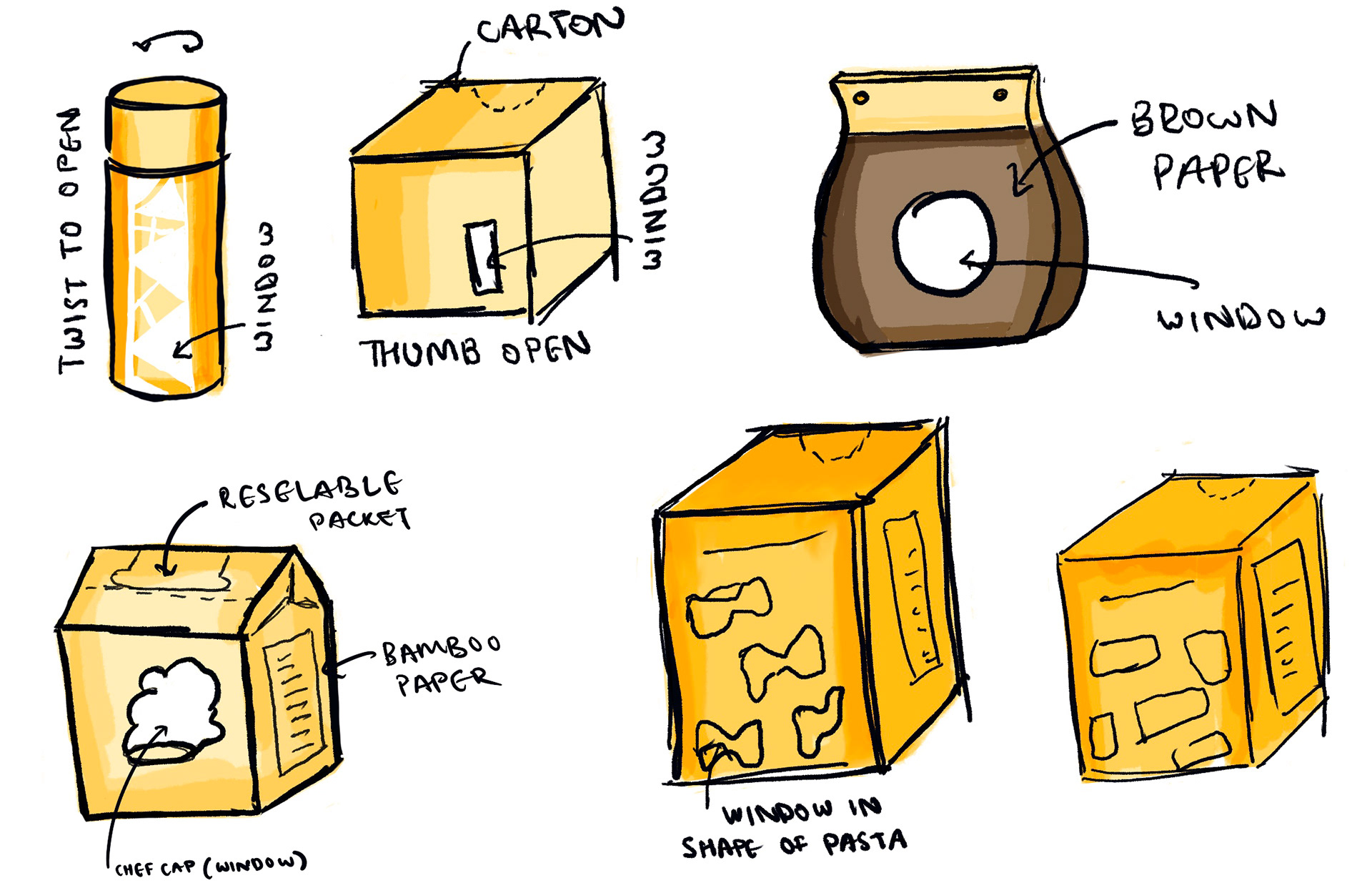
The Pastalina packaging was designed to be playful and functional, with early sketches exploring unique box structures and pasta-shaped windows. The final chef’s hat window creatively showcases the pasta while reinforcing the brand’s artisanal feel.
The mascot development focused on creating a charming chef with an exaggerated cloud-like hat, doubling as a window. His bold mustache and confident stance enhance the Italian-inspired personality of the brand. This fusion of interactive packaging and character-driven branding makes Pastalina a fun and memorable experience.
Dieline
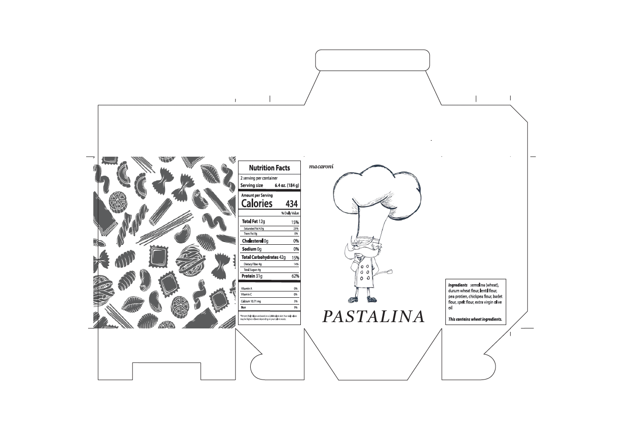
The dieline outlines the technical specifications for a pasta package, detailing the precise shapes, folds, and cuts needed for assembly. It incorporates functional elements such as flaps, tabs, and sections for adhesive application to ensure structural integrity. Designated areas for branding and labelling align with the package’s final form, while provisions for a cellulose film window may allow product visibility. Technical features like score lines enable accurate folding without damage, while cut lines and registration marks guide production for precision. The die line also accounts for material thickness, ensuring compatibility with eco-friendly substrates like kraft paper or bamboo-based sheets.